Product design · Mobile UX · 2023
We make a boring task more bearable.
DMVme puts drivers back in the driver’s seat with smarter appointments, useful resources, and clearer control over every visit.
Drive into the case study ↓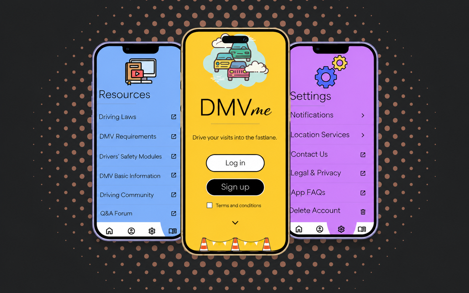
Case study8 week project
What01
A mobile app that moves with you
Less waiting around. More knowing what comes next.
DMVme is a mobile app designed to solve the long, uninformative, and unorganized experiences people often have at local DMVs.
It personalizes the visit by allowing drivers to schedule appointments, set custom notifications, and connect with valuable resources that support their driving education.
The fast lane
How does it work?
Select a date and time that works for you
Confirm your appointment
Cancel or reschedule anytime
Who02
An app for the people
Designed for drivers, not imaginary users with perfect patience.
User personas helped me consider the diversity that drives our design initiatives and the different ways people would use DMVme.
Start with the audience
DMVme was designed for everyone, with special attention to people who value convenience and want a product they can download once and use repeatedly.
Separate distinct needs
I contrasted an experienced business driver with a new driver focused on safety, so the product would support both efficiency and education.
Translate traits into priorities
Elijah’s need for convenience shaped appointment control. Sara’s need for reassurance strengthened safety resources, preparation, and clarity.


Reduce wasted time through preferred locations, appointment management, subscriptions, and visit history.
Make rules, requirements, safety modules, and official resources easy to understand before a first visit.
Why
A more educated driving community keeps all of us safer.
Appointments and critical actions are easy to find and manage.
Official resources help drivers arrive informed and prepared.
Shared knowledge turns a solo errand into collective support.
How03
The original
A simple system creates an easier learning curve.
Wireframes established the structure before visual styling entered the room.
They document the actual interface decisions: images create recognition, official links build credibility, legal information stays visible, tabs organize dense content, and critical actions receive stronger emphasis.
image
DMVmeTerms and conditionsimage
ProfilePersonal Information›Upload Identification›Favorite DMVs›Previous Visits›Manage Subscriptions›image
SettingsNotifications›Location Services›Contact Us›Legal & Privacy›Delete Account›image
ResourcesDriving Laws↗DMV Requirements↗Safety Modules↗DMV Basic Info↗Community Q&A↗DMVmeBrand palette
Super Simple Styling.
Bright, conversational color helps DMVme feel friendly, educational, and easy to navigate, even when the task itself is anything but exciting.
#FFD334Primary energy
#4DCC71Success
#D289FFSupport
#85B6FFInformation
#000000Of course
App architecture
We thought of everything, so users don’t have to.
DMVme
Home
Log in / Sign up
Terms and Conditions
Set Preferred DMV
Make Appointment
Cancel Appointment
Profile
Personal Information
Upload Identification
Favorite DMVs
Previous Visits
Your ServiceYour ServicerSatisfaction Rating
Manage Subscriptions
Billing Info
Settings
Notifications
Location Services
Contact Us
Legal and Privacy
Delete Account
Resources
Driving Laws
DMV Requirements
Drivers’ Safety Modules
DMV Basic Info
Driving Community
Q&A Forum
Critical journey
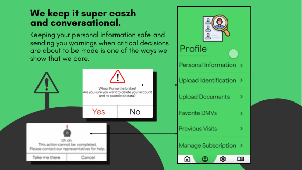
Trust before upload.
Keeping personal information safe and warning users before critical decisions is one way DMVme shows care.
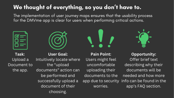
Task
Upload a document
- User goal
- Quickly locate the upload action and successfully add a document.
- Pain point
- Users may feel uneasy sharing identification because of security concerns.
- Opportunity
- Explain why documents are needed and connect users to clear privacy FAQs.
The destination